Because of personal circumstances, I was looking for a new church to attend. This was just before the pandemic started when in-person gatherings were the norm.
I Googled “churches near me” and filtered for the denomination of my choice. There were a few hits.
Instead of physically visiting them all, I did what any busy person would do. I went to their websites.
The first one was shockingly outdated. Most likely created decades ago, the website’s bright backgrounds, flashy fonts, and old-fashioned typeface made me wonder if the church forgot they had a website that people could see.
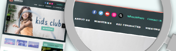
The second website was frustrating to navigate. The large menus obscured the main website interface. There were also too many options with long text labels. Every time I went to a different page on their site, I became confused and frustrated because the primary navigation bar was not consistent.
The next one had a “not secure” notification on my web browser so I immediately left the page. It was just not worth the risk. If it’s not a secure, encrypted site, then I’m just not that interested in what they had to say.
One of the last websites was passable, but suffered from the lack of responsive web design. It’s just a fancy term that means the web pages look good on any size screen—from large computer screens to tiny mobile phones. The layout will automatically adjust to give the user a great experience. This is no longer a “nice” feature, but an essential part of any modern website. Not many people know that the Google algorithm will penalize websites for not being responsive by ranking them lower. Churches can lose many leads this way.
Disappointed with these search results, I told Google to widen the radius of my search and loosen up the denomination filter. I was willing to drive much farther and rethink my convictions about which mode of baptism is more biblical!
It may seem irrational, but these were honest first reactions I had of these churches.
The sad thing is these churches are most likely wonderful congregations with warm, loving people. But I would never know because I never ended up stepping into their lobby. Sadder still is that these churches would never know how many potential attendees chose not to visit because of their website.
They are not aware that their bad websites are miscommunicating so much. That good websites can communicate who they really are—their heart, their mission, their culture.
It may not be fair, but it is the zeitgeist of our day. The seven seconds it takes to make that first impression is no longer from a firm handshake with an usher at the door or the opening of a pastor’s sermon. Irreversible first impressions are now formed online.
If a church’s website is outdated and neglected, people wonder what else or who else has been neglected. Perhaps one opportunity the current pandemic has created for many churches is to focus on their online presence and improve their websites. This will prepare them for the near future when in-person gatherings will once again resume and people (like me) will once again start looking for a place of worship to attend.
For churches that aren’t confident of their website, it’s not too late to ask questions and make some changes. Sunergo has many website framework designs that are beautiful and evergreen so they never look outdated. They are also secure, easy to navigate, and web responsive. With these frameworks, anyone who knows how to click and drag can regularly update their content with ease.
If you are not sure whether your website is creating the right first impression that matches your identity as a church, contact us today. We have experts who can give you honest feedback and advice to help with your needs.
This material has been prepared for informational purposes only and reflects the opinion of the author. It is not intended to provide, and should not be relied on as professional advice. You should consult appropriate professionals for your specific situation.